Our Logo & Mascot
Our Logo
*This photo is for illustrative purposes only
In Japanese, Kin (金) means gold and Chan (ちゃん) is an endearing suffix attached to young kids. Kinchan represents our belief that children are precious kin - to treasure and to hold.
It conveys our store's brand promise to only bring in Japanese brands - feat. thoughtful and ever-reliable products in the unpredictable world of raising precious kin.
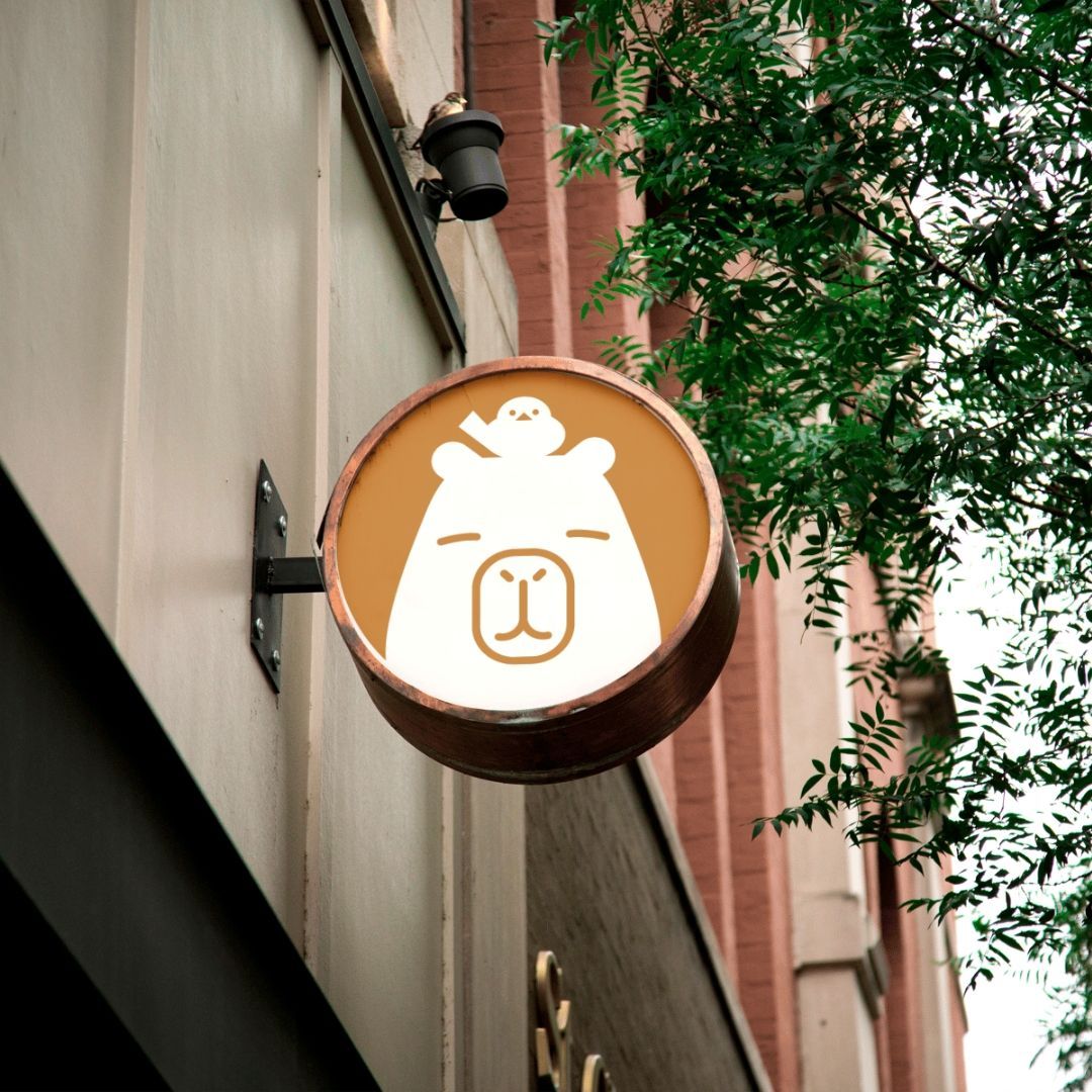
Our Logomark
*This photo is for illustrative purposes only
Can you guess what it is? It's a Capybara and a Shima enaga (native to Hokkaido)!
Both are symbols of Japan and live in groups of more than 10. Just like how it takes a village to raise children, these adorable creatures are no different. And they're in gold to embody the "Kin (金)" in "Kinchan (金ちゃん)".
Our Mascot
Kin-chan (Capybara) and Rin-san (Shima Enaga)'s friendship started when Rin-san spotted Kin-chan trying to sneak into a strawberry farm to pluck his favourite fruit in lush, serene Hokkaido, Japan.
With her agile flying and keen eyesight, Rin-san flew in when the door was open and snuck one out to Kin-chan. Grateful for her help, Kin-chan thanked her by giving her a sakura flower, which she found endearing and sweet.